UI design - royaldutchmint-corporate.com

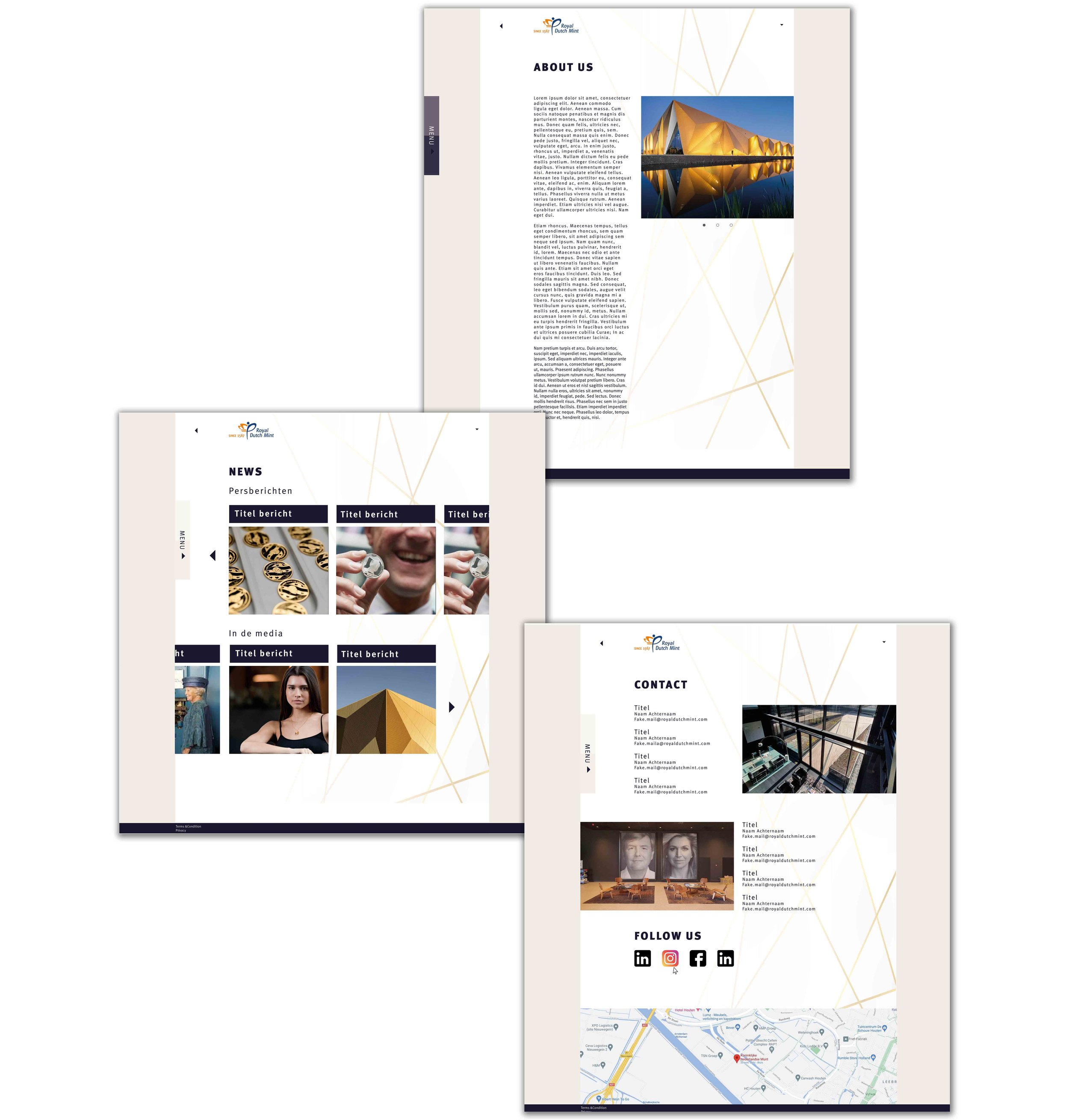
For Royal Dutch Mint I created a corporate website for business partners to find all information corporate related.
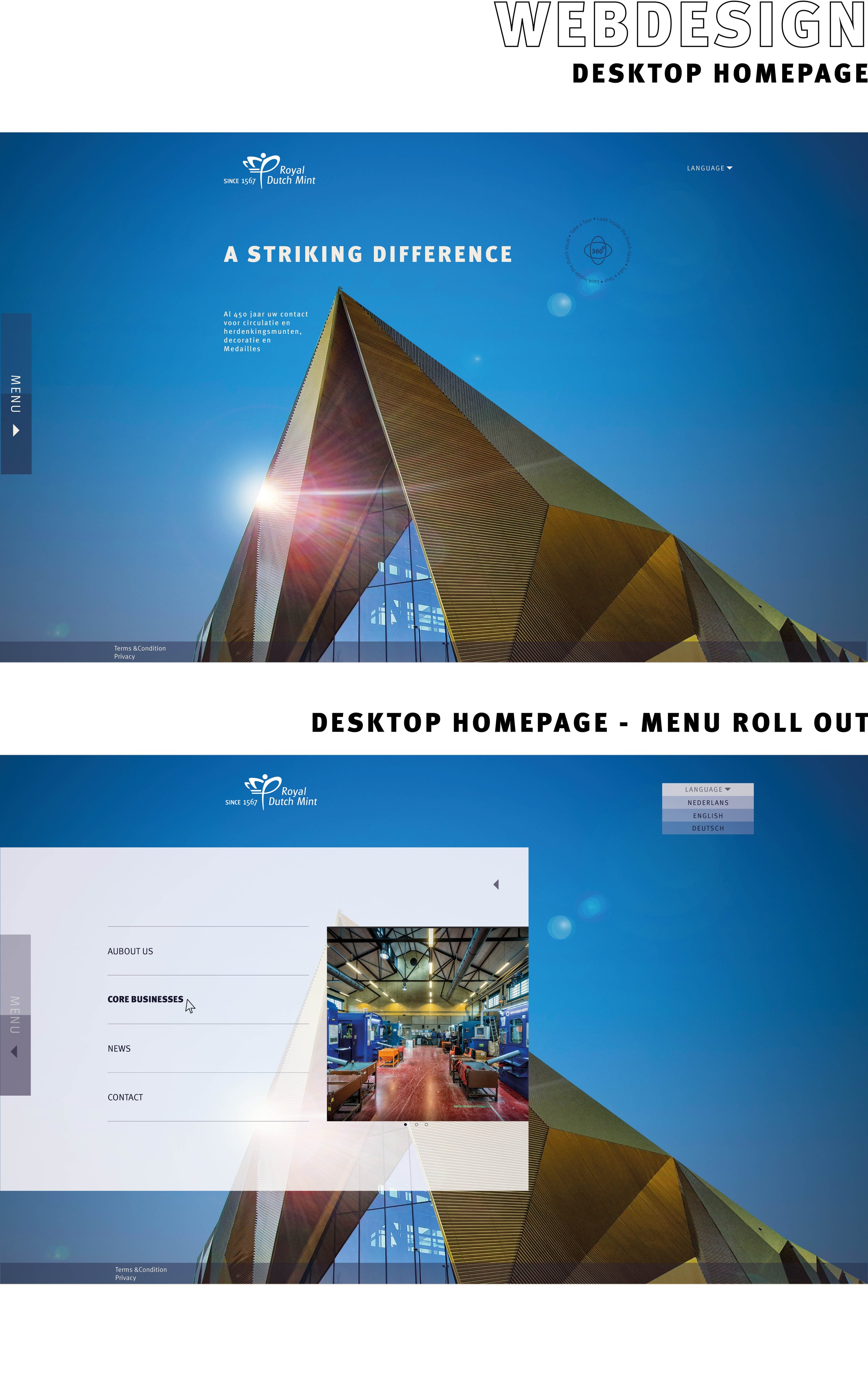
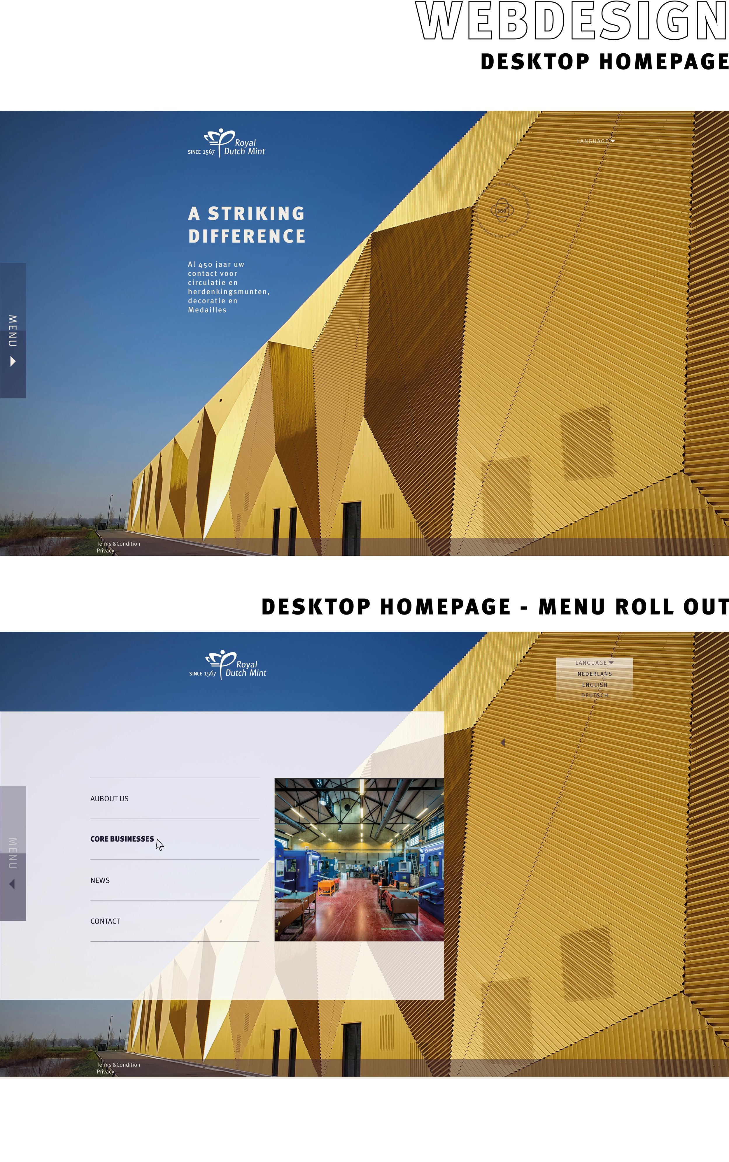
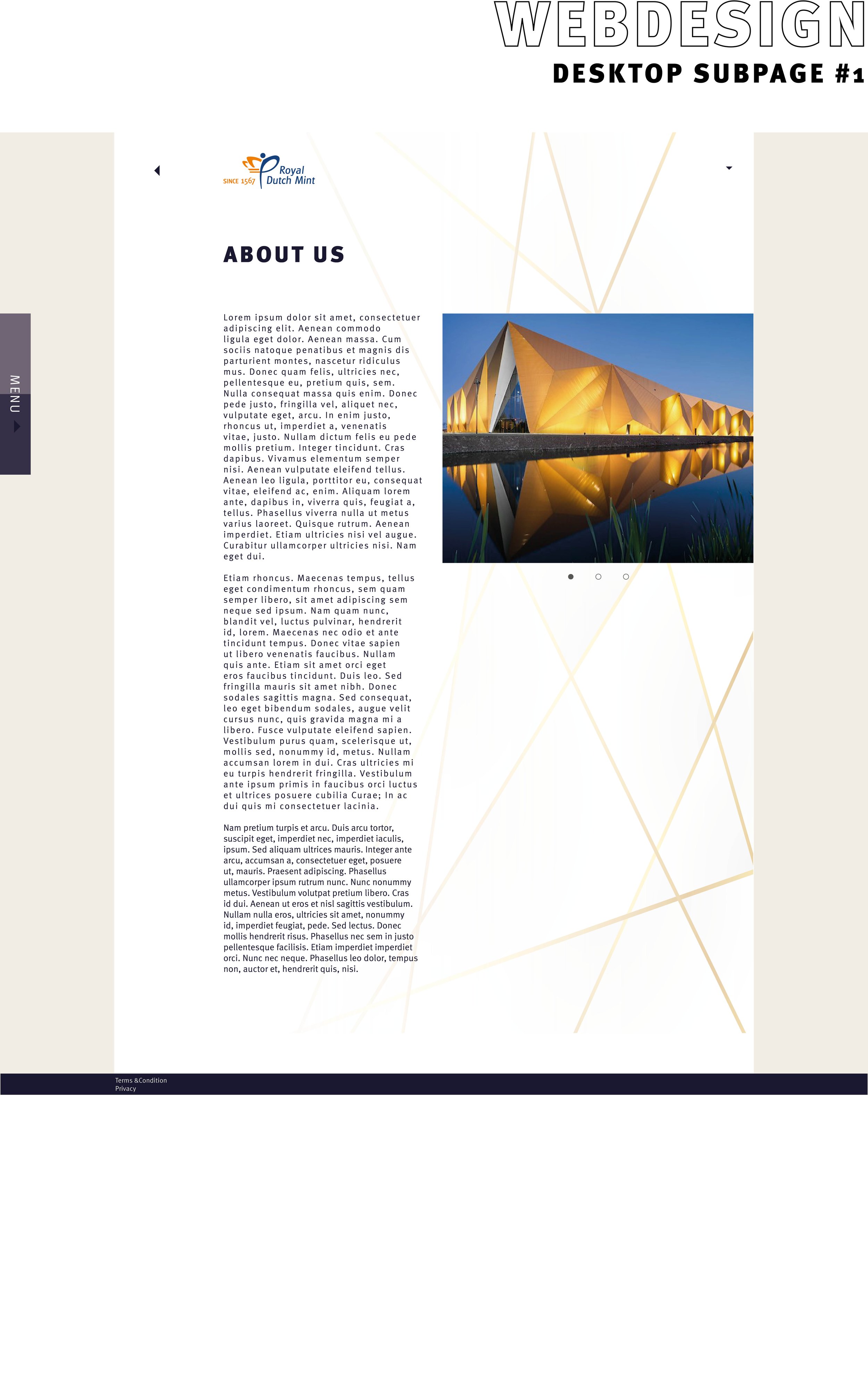
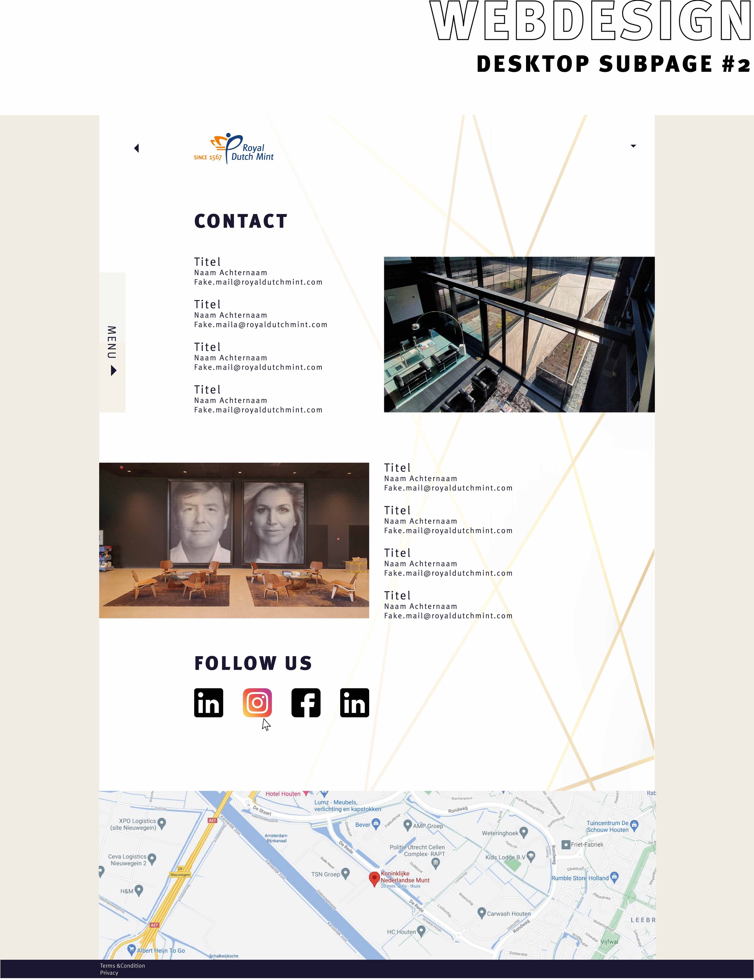
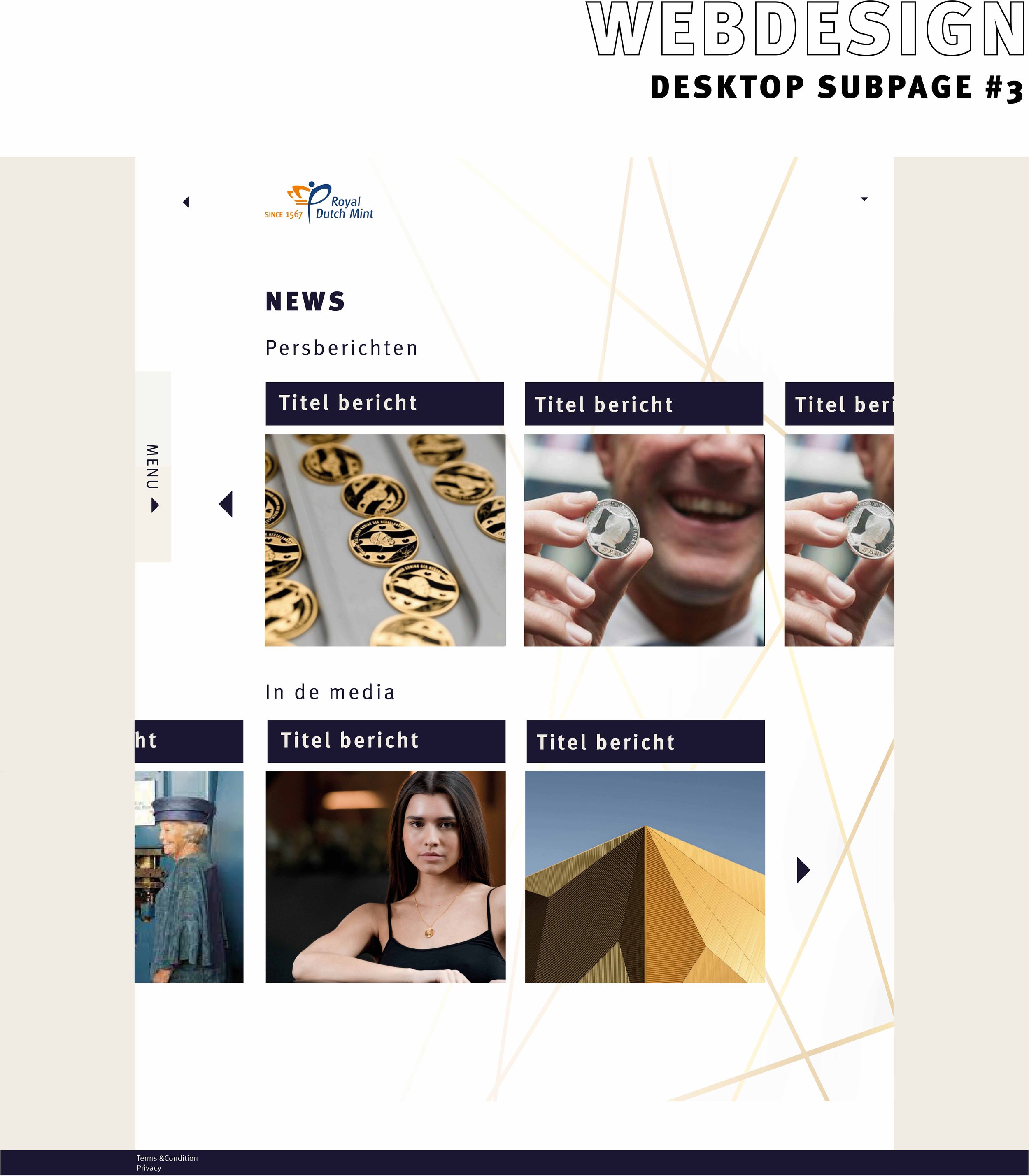
The look and feel of the website needed to be clean, minimalistic and clear.
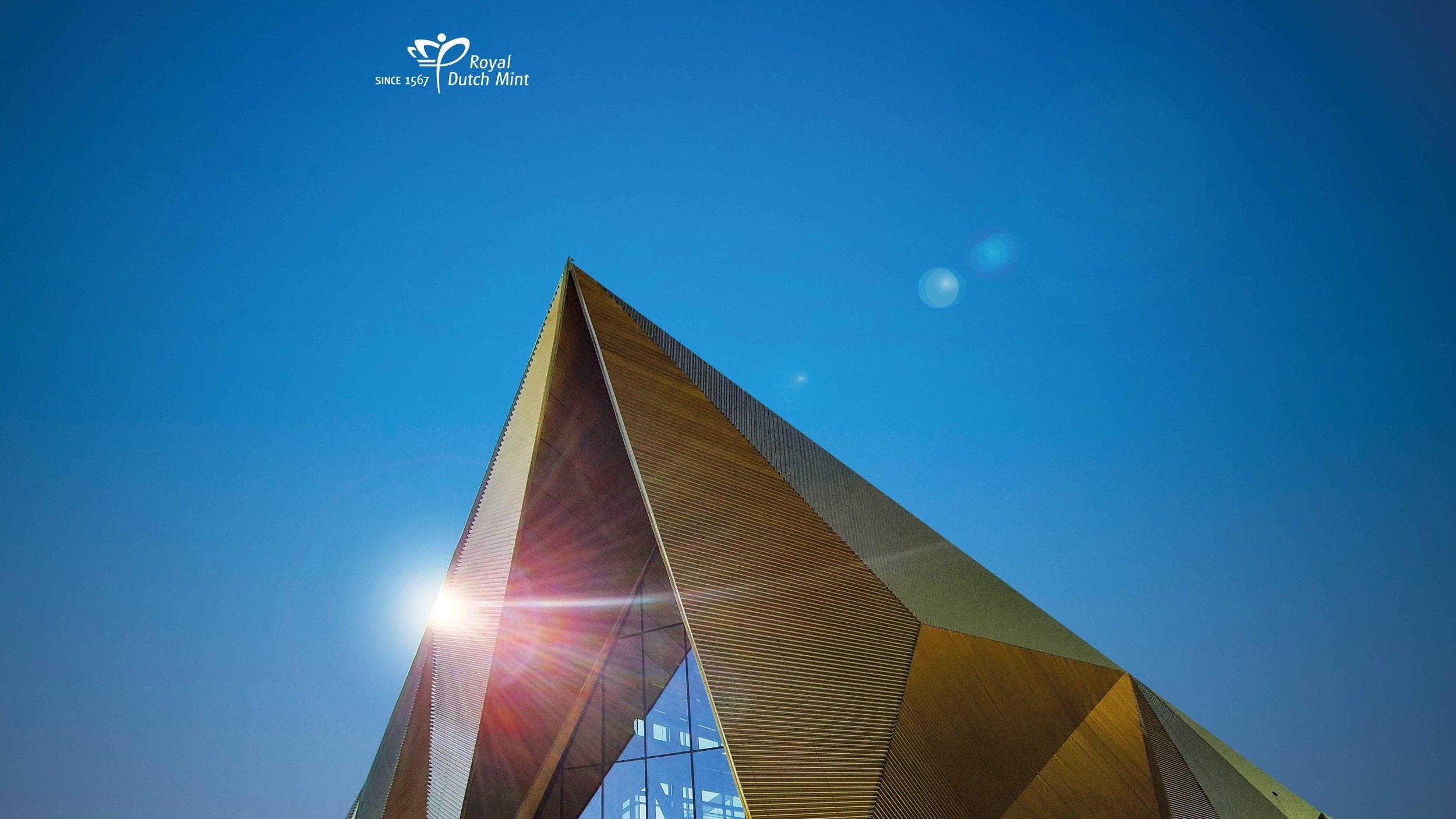
I’ve created a quick intro that gives some movement on the sleek design. The intro is a quick overview on what RDM create and sells as a company. It slides slowly into an image of the HQ “The Dutch Vault” that is an eye catcher of itself and newly build in 2019 and 2020. The gold lines are based on the shapes and color of the building and are added all the way trough the website.
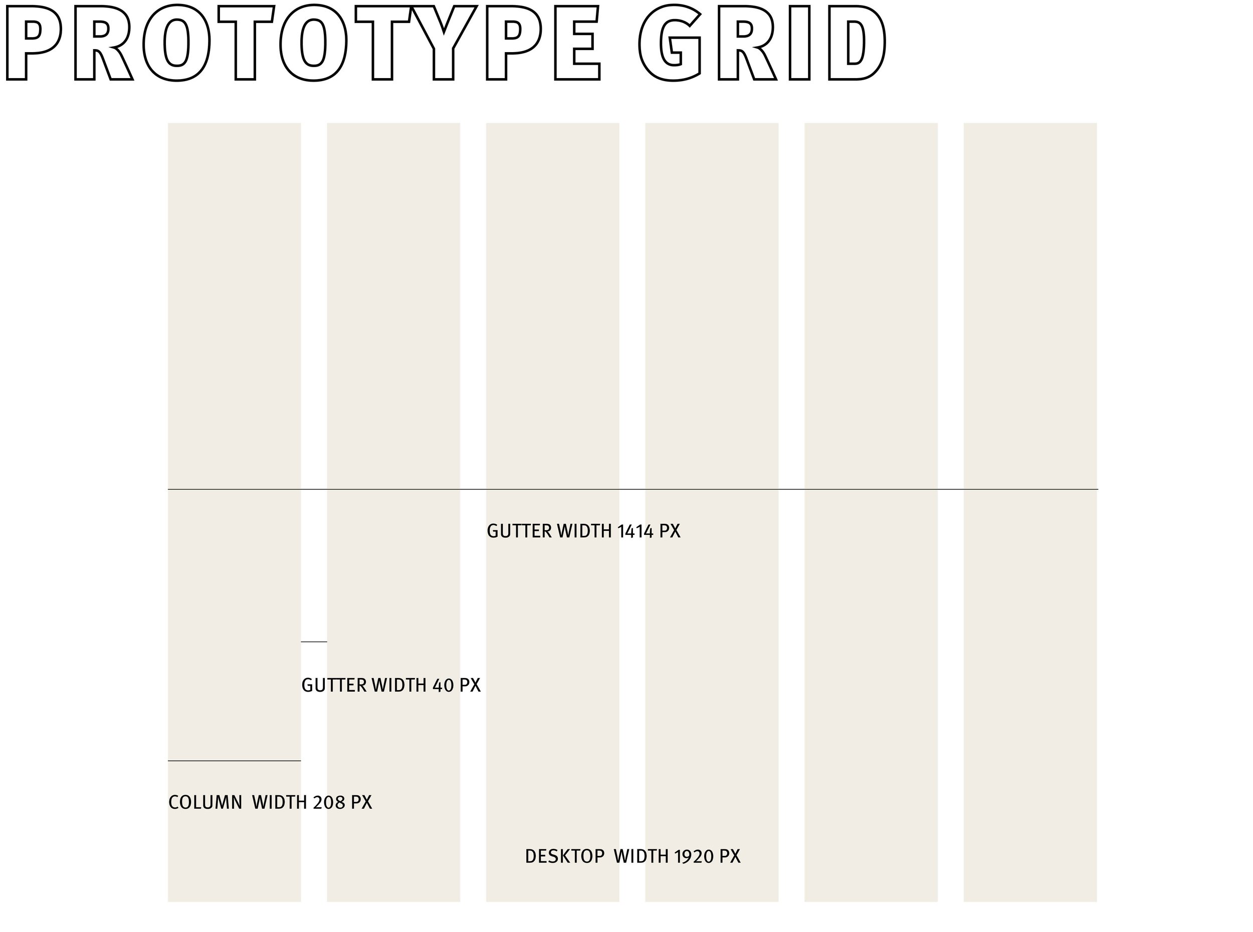
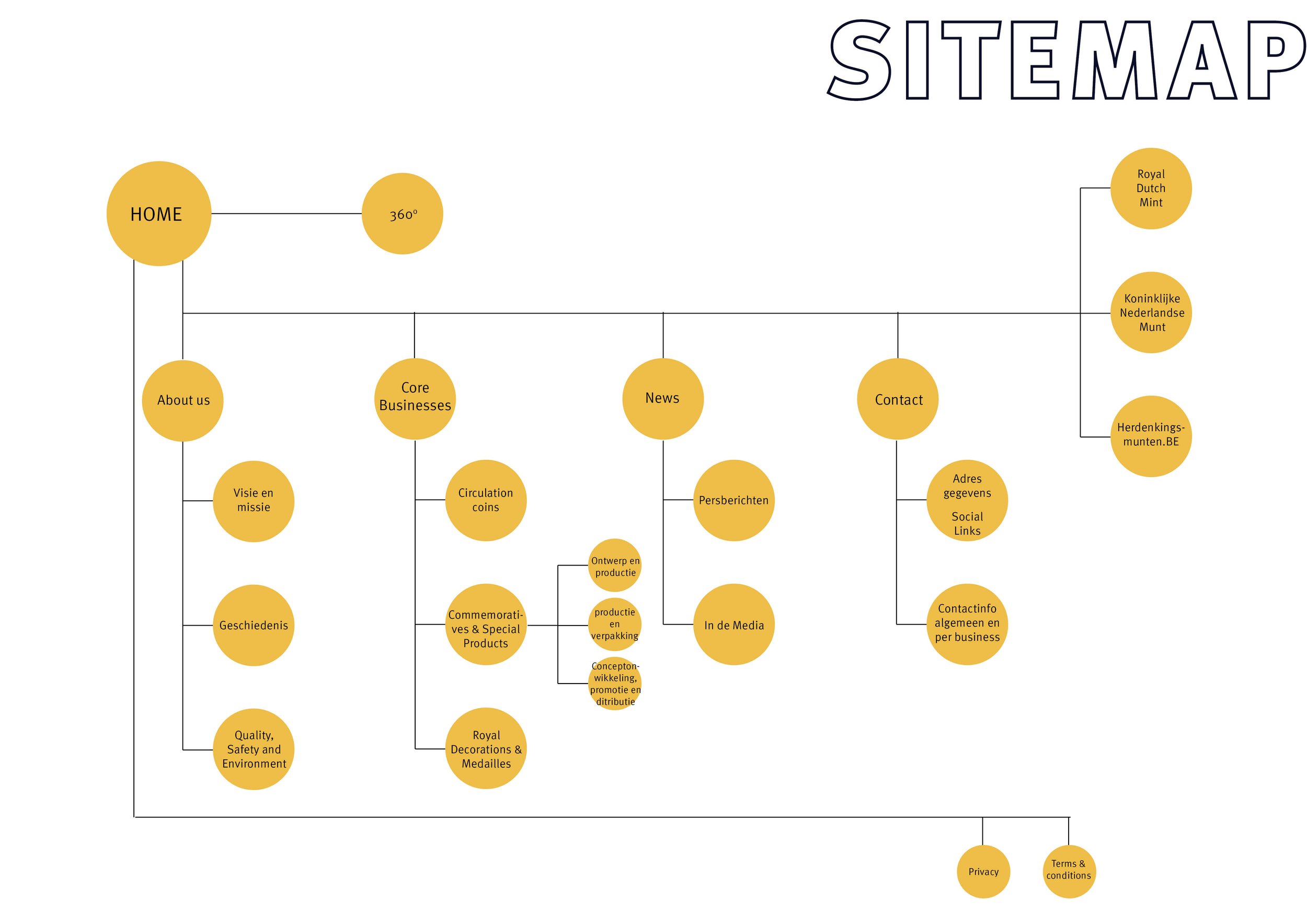
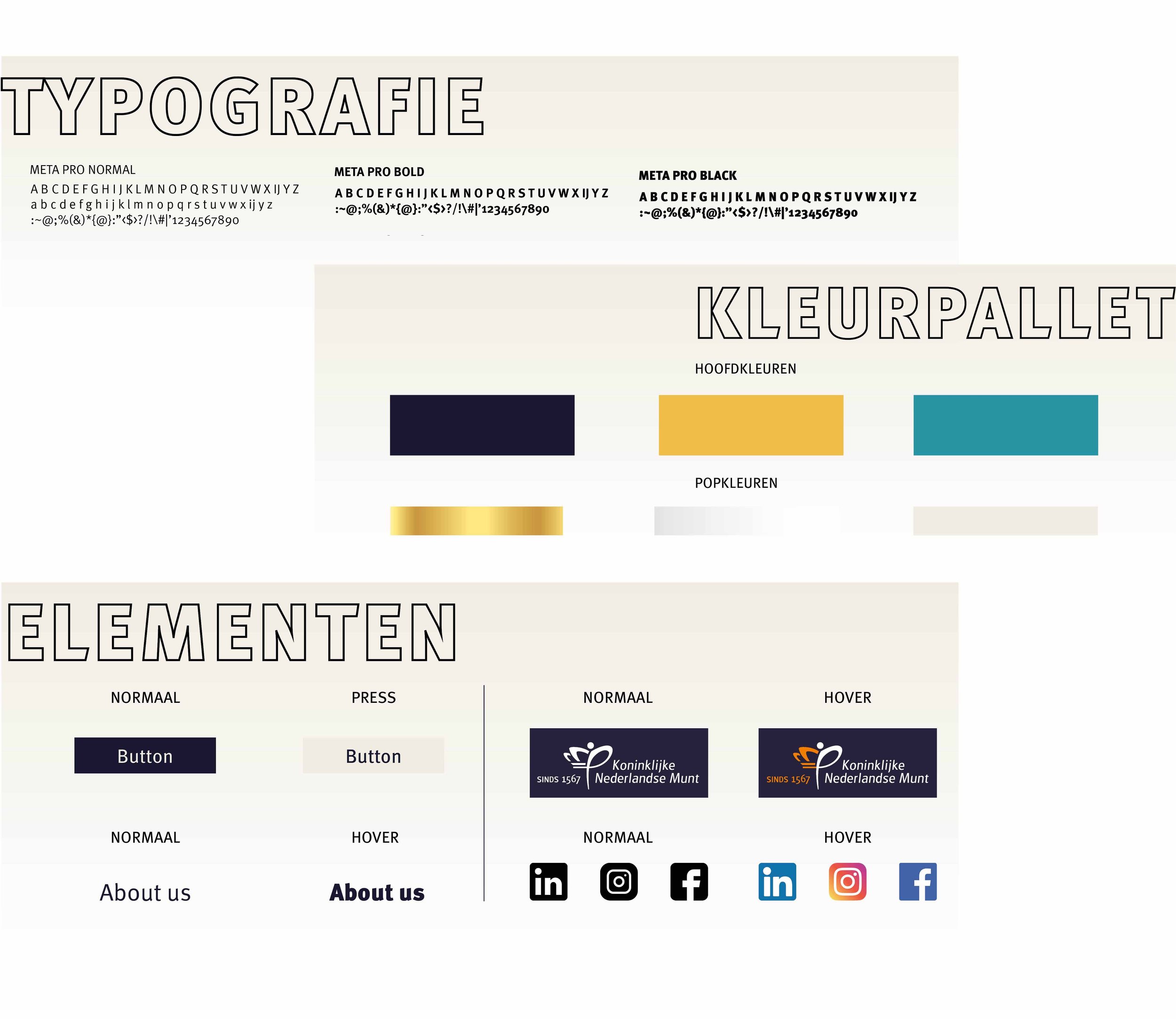
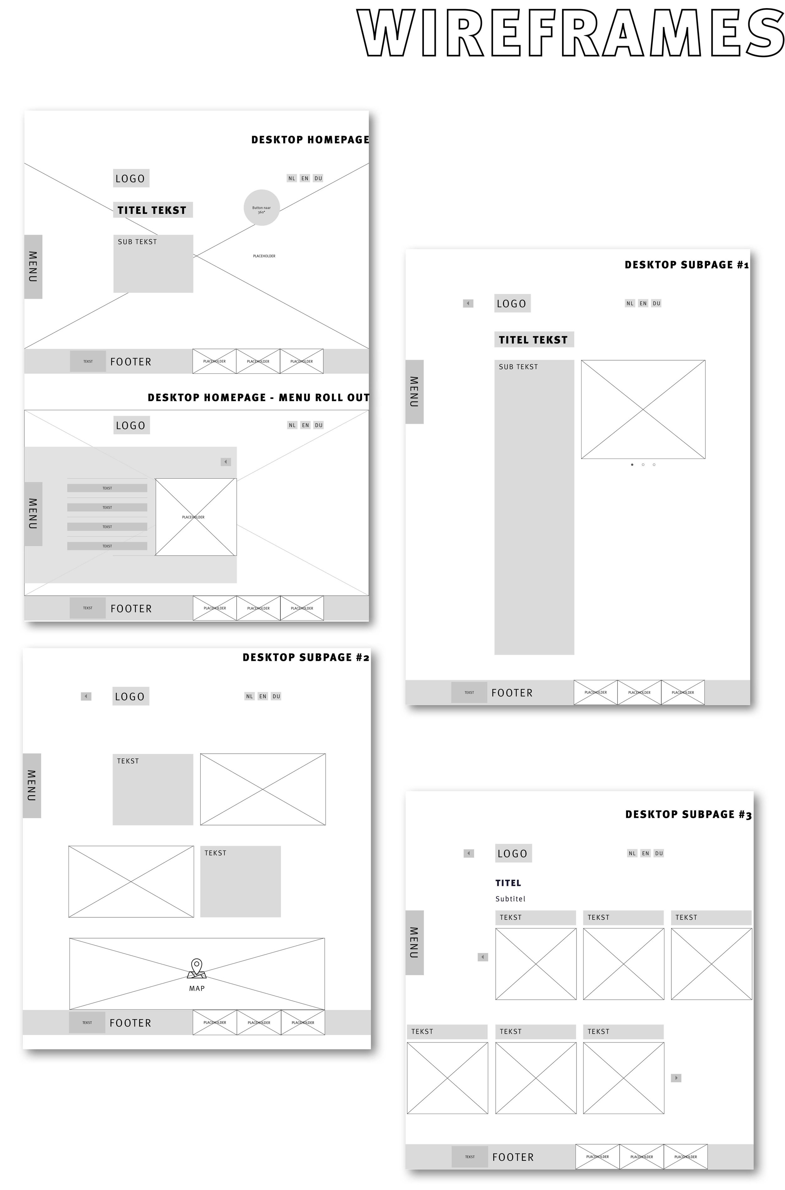
For the webpages I’ve created a color pallet based on the colors used on all commercial branding, and webshops. But added a more royal look to it by turning orange into gold/yellow and turning bright blue into a darker more marine blue. I have created a user friendly grid, a sitemap, and set up the wireframes that have been adjusted a little bit by setting up the website.
The board of Royal Dutch Mint received this design with great enthusiasm.
The intro

Homepage royaldutchmint-corporate.com